Transportation Service
Metrolinx offers transportation services and brands across Canada. The primary product is the official website — enhanced to better showcase company news, promote global solutions, and improve the overall user experience.
Challenge
The main challenge was aligning three distinct websites and brands under Metrolinx while ensuring a seamless and cohesive user experience. This required balancing each site's unique identity with the need for consistency across the entire digital ecosystem.
My Role
- Establish and Implement Design System — Develop and maintain a cohesive design system to ensure consistency across all digital products.
- Design and Develop User Flows, Wireframes, Prototypes, and UI — Create and iterate on user flows, wireframes, prototypes, and high-fidelity UI designs to support an intuitive and engaging user experience.
- Stakeholder Presentation — Present mockups and prototypes to stakeholders, incorporating feedback to align design solutions with business goals and user needs.
Personas
Understanding the unique users of the different Metrolinx domains allows us to align and focus our solution around the people who will ultimately use it.
Robust Trip Purposes for transactional UP Express & GO Transit
Gaps in audiences served by Metrolinx.com, Engage, Blog
Identified 12 main audiences, with additional sub-audiences, across current domains
Primary form factor to visit using mobile
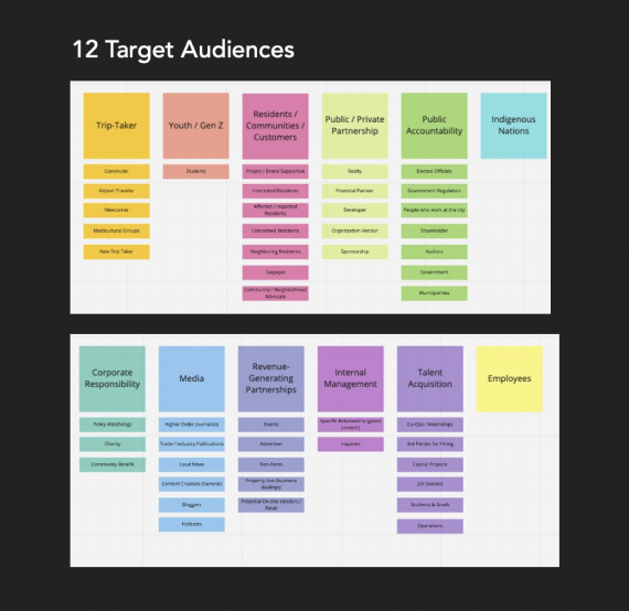 12 Target Audiences
 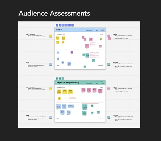 Audience Assessments
 - Important to provide a single source of truth for several audiences (e.g., Media, Corporate Responsibility) — comprehensive, complete view of projects is important for audiences (Residents / Community).
- Audiences are triggered to visit Metrolinx websites for different reasons, however they are often looking for similar information (e.g., impact of a project, someone to contact, news or signage).
Design Principles
Purposeful
All design choices are made with our user needs and brand purposes in mind.
Modular
The system's modularity allows for maximum flexibility. The components are designed to work seamlessly in any combination with each other. They can also be expanded upon in the future.
Concise
The system's modularity allows for maximum flexibility. The components are designed to work seamlessly in any combination with each other.
Consistent
Every component is thoughtfully designed to ensure a consistent user experience across all platforms. Consistency also to streamline the design process through creation of reusable components.
Visual Identity
Metrolinx, GO and UP each serve different purposes for different users. Our design system will be brand agnostic to allow for sub-brand expression to come through while maintaining a consistent experience overall.
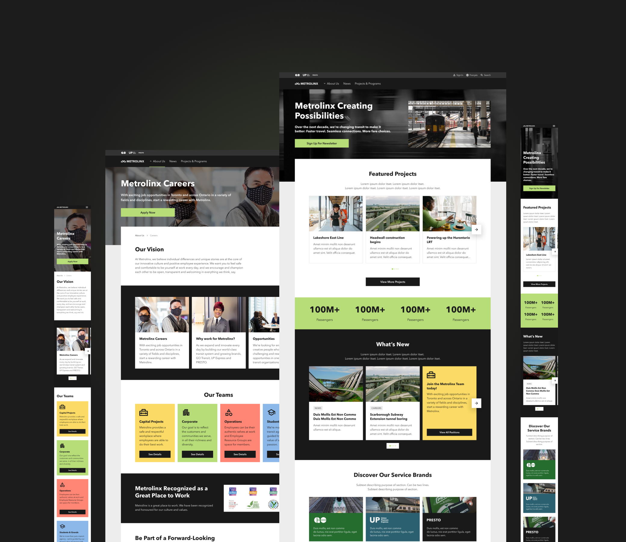
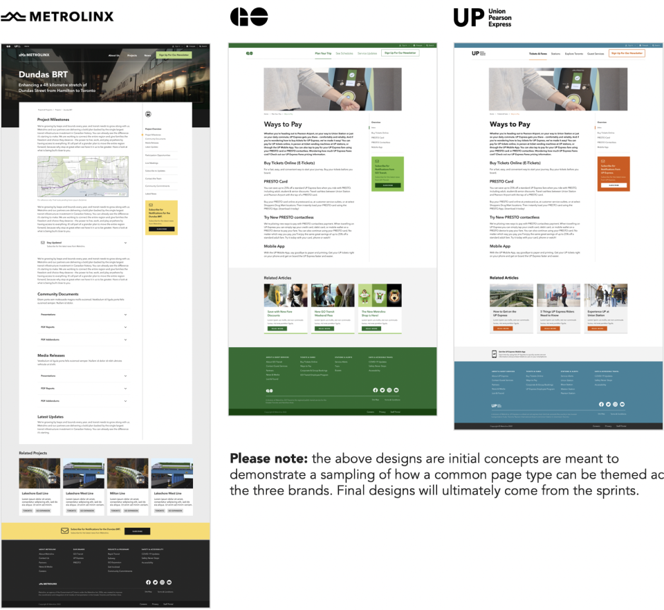 Metrolinx · GO · UP — brand theming
 Design System
We reviewed the current design system files to assess what has been done, what needs extending and what needs to be created. The current design system and components were vetted against what we heard in discovery and by considering design system best practices.
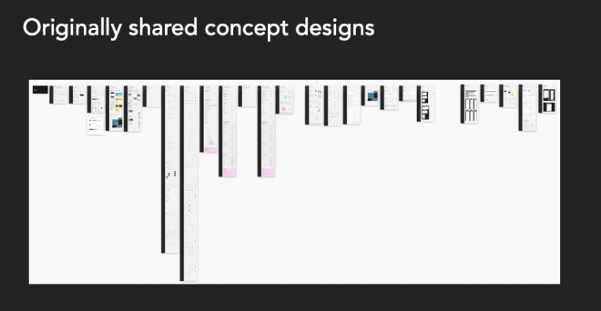 Originally shared concept designs
 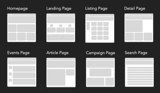 8 page templates defined
 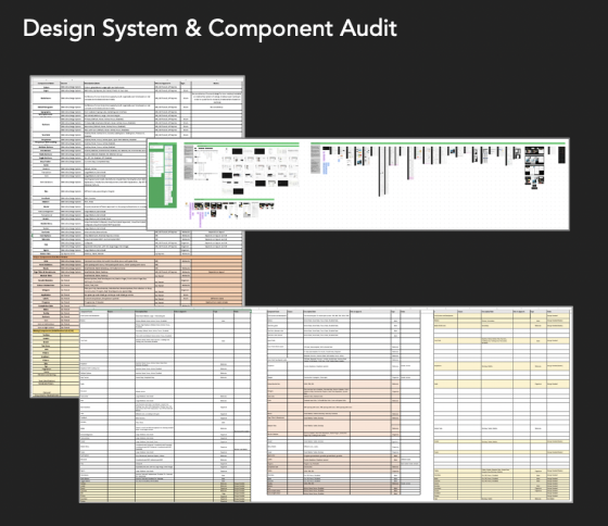 Design System & Component Audit
 Audit Findings
Current files serve as a good starting point — establish base foundational rules and set up the look and feel.
Between MX, GO and UP there were inconsistencies found between similar or duplicate components.
Missing components were identified.
Accessibility rules will need to be considered.
Rules around interaction design will have to be created.
Breakpoint sizes are outdated — will need to adjust to latest standards.
Establish a robust design system that prioritizes reusability and accommodates flexibility.